
[lwptoc float=”none”]
Settings(Pro Version):
From version 2.1 covers are automatically responsive.
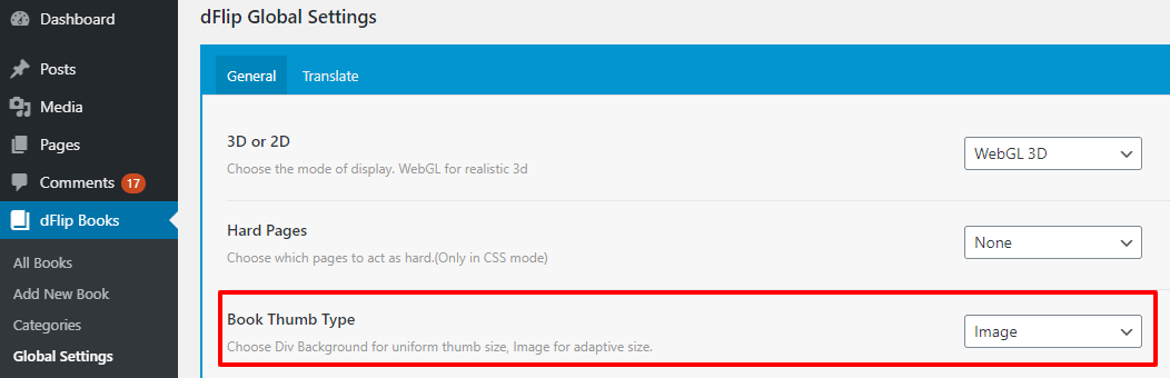
The settings are available under dFlipBooks -> Settings as Book Thumb Type. Available options are Image and Div and respective HTML elements will be used to display the thumb image. We recommend using Image option for advanced users.
Note: The value can be overridden from shortcode using thumbtype attribute.
Case: Image background (Recommended):
[dflip books="all" limit="8" thumbtype="img"][/dflip]
Outline testCalendar ModeCalendar Spiral BookDearFlip Brochure SpiralOpen BookTransparent BackgroundOpen BookCORS Book
Case: Stretch background.:
[dflip books="all" limit="8" thumbtype="div"][/dflip]
Outline testCalendar ModeCalendar Spiral BookDearFlip Brochure SpiralOpen BookTransparent BackgroundOpen BookCORS Book
Responsive CSS:
.dflip-books {
}

.dflip-books ._df_thumb {
    margin-left: 0;
    margin-right: 0;
    padding-left: 10px;
    padding-right: 10px;
    box-shadow: none;
}

.dflip-books ._df_thumb:before {
    content: " ";
    box-shadow: 0 1px 2px rgba(0,0,0,0.22);
    height: 100%;
    position: absolute;
    top: 0;
    left: 10px;
    right: 10px;
}

.dflip-books ._df_thumb[thumbtype="img"] img {
    max-height: 100%;
}

.dflip-books ._df_thumb[thumbtype="img"] {
    width: 25%;
}

.dflip-books ._df_thumb[thumbtype="div"] {
    width: 25%;
}

@media only screen and (max-width: 900px) {
    .dflip-books ._df_thumb[thumbtype="img"] {
        width: 33.33%;
    }

    .dflip-books ._df_thumb[thumbtype="div"] {
        width: 33.33%;
    }
}

@media only screen and (max-width: 700px) {
    .dflip-books ._df_thumb[thumbtype="img"] {
        width: 50%;
    }

    .dflip-books ._df_thumb[thumbtype="div"] {
        width: 50%;
    }
}

@media (max-width: 400px) {
    .dflip-books ._df_thumb[thumbtype="img"] {
        width: 100%;
    }

    .dflip-books ._df_thumb[thumbtype="div"] {
        width: 100%;
    }
}
All DearFlip comments and discussion have been moved to
https://github.com/dearhive/dearflip-js-flipbook/discussions